Defining Properties

We call PROPERTIES to all those values used inside your AddOn that you want to let the publishers of Mobincube edit in order to customize and adapt the AddOn to their own needs.
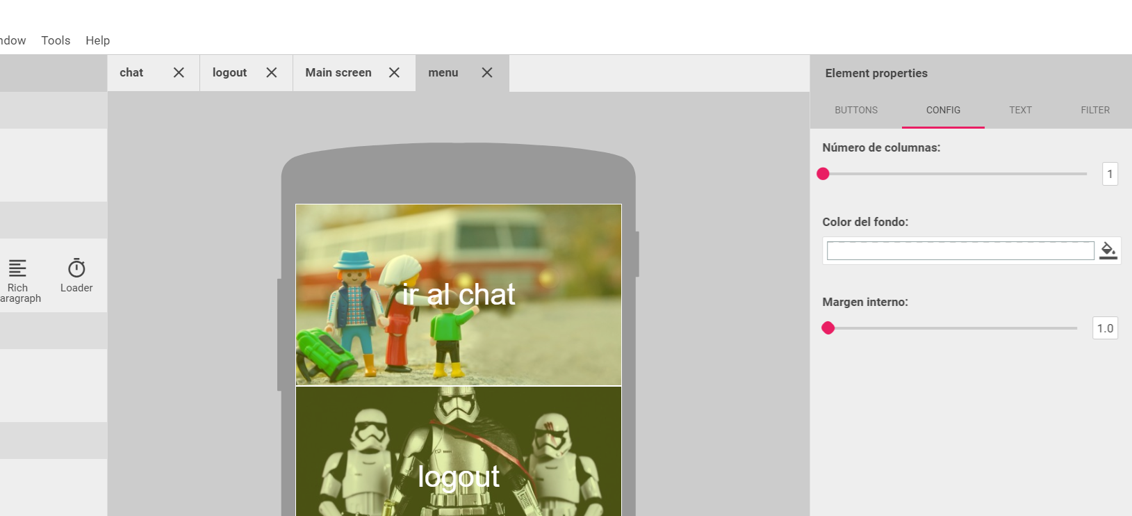
All the properties must be defined in a unique file called properties.json, which uses standard JSON format. This filed has to be placed in the root folder of your AddOn. Properties can be grouped by TABS, which is really useful to make things easier for you and the publishers.
"tabs": [{
"key": "firebase",
"label": "Firebase",
"properties": [{
"key": "moduleInstructions",
"type": "label",
"label": {"en":"Instructions:","es":"Instrucciones:"},
"value": {"en":"This add-on works with the login add-on only. Please be sure that you've added that other module and it is loaded before the logout screen.","es":"Este add-on es un complemento al de login. Asegúrate de haber añadido la pantalla de login y que se muestra con anterioridad a ésta."}
},{
"key": "backgroundColor",
"type": "color",
"label": {"en":"Background color:","es":"Color de fondo:"},
"value": "rgb(0,0,0)",
"format": "hex"
},{
"key": "destinationScreen",
"type": "screen",
"label": {"en":"Destination screen:","es":"Pantalla de destino:"},
"value": ""
},{
"key": "notice",
"type": "label",
"label": {"en":"Important:","es":"Importante:"},
"value": {"en":"Keep this screen as an anchor point, so that the user can't navigate to previous screens after logout.","es":"Mantén esta pantalla como punto de anclaje para evitar que los usuarios puedan navegar por las pantallas anteriores después de hacer logout."}
}]
}]
}
When the publisher is editting your AddOn, Mobincube takes all those properties and converts them into visual input elements, so that the publisher can change property values from Mobincube's visual interface. That way, publishers don't need any html skills whatsoever, since they will never have access to the source code.
Within the properties.json file you can set default values and define the range of values that the publisher is allowed to choose. The way you can define those expected values depends on the type of property (the type of value you are asking the publisher to customize). There are different types f properties that you can use:
Additionally, you can use some non-editable properties in order to organize the properties inside Mobincube's properties panel or give the publisher some instructions on how to set-up the AddOn. These properties will make things easier for the publisher and you AddOn will be more successful:
- Label
- Image
- Video
- Line
Regardless its type, all the properties have to have these parameters:
Values:
text|range|color|checkbox|list|map|date|select|screen
Example:
{"en":"text in english","es":"text in spanish"}
TEXT properties
Lets publishers enter a text value. The value will be stored as a String
RANGE properties
Lets publishers enter a number value. The value will be stored as a Double. Mobincube will use a slider bar, so the user can pick a value. There will also be a text input next to the slider, in case the publisher prefers to write the value.
COLOR properties
Lets publishers enter a color value. The value will be stored as a String. Mobincube will use a color picker, so the publisher can pick a value. The color picker accepts alfa channel selection.
Values:
hex
CHECKBOX properties
Lets publishers enter a color value. The value will be stored as a String. Mobincube will use a color picker, so the publisher can pick a value. The color picker accepts alfa channel selection.
SELECT properties
Lets publishers select one or several options. The value will be stored as a single value or as an array. Mobincube will use a SELECT input, so the publisher can pick a value (or several of them).
DATE properties
Lets publishers select a date value. The value will be stored as a timestamp. Mobincube will use a date picker input.
MAP properties
Lets publishers select a gps location value. The value will be stored as a String containing latitude and longituded separated by a comma. Mobincube will use a google maps div to pick a location.
SCREEN properties
Lets publishers select a destination screen, in case your addon wants the app to open another screen after some user action. The value will be stored as a String. Mobincube will use a select input and will fill it automatically with all the screens of the app in the moment when the publisher tries to select a destination screen.
LIST properties
List are arrays of groups of properties. The length of those arrays are unknown for you, it is the publisher the one that will decide the number of items in the array. List are useful in so many cases. For instance: if you develop an image gallery addon, you might want publishers to add as many images as they want.
Here's an example of list:
"key": "cellList",
"type": "list",
"label": {
"en": "List of cells:",
"es": "Lista de celdas:"
},
"buttonLabel":{"en":"Add cell","es":"Añadir celda"},
"schema": [{
"key": "cellBackground",
"type": "color",
"format": "hex",
"label": {
"en": "Cell background:",
"es": "Color de fondo de la celda:"
},
"value": "rgba(255,255,255,0)"
}, {
"key": "cellWidth",
"type": "range",
"label": {
"en": "Cell width (columns):",
"es": "Ancho de la celda (columnas):"
},
"min": 1,
"max": 10,
"step": 1,
"value": 1
}],
"value": [{
"cellBackground": "#FFF",
"cellWidth": 2
},{
"cellBackground": "#F00",
"cellWidth": 3
}]
}
In order to access some value of one items of the above list from JavaScript, you should use properties.properties.cellList[1].cellWidth.
FILE properties
Lets publishers pick a resource from the resource manager of Mobincube. The value will be stored as a String with the URI to the file. You can set a default value that points to a file inside the addon's zip file, but once publishers pick a file from the resource manager, they won't be able to select the default file again.
- fileType (an array including all the file types accepted)
- fileName
LABEL properties
This is only an informative property, so you can add instructions on Mobincube's properties panel, in order to make it easier for the publisher to understand how your addon works.
IMAGE properties
This type is currently not available.
VIDEO properties
This type is currently not available.
LINE properties
This type is currently not available.